Generic cross-validation
Definitions
k-fold cross-validation
Cross-validation is a process that enables to estimate the out-of-sample performance of a model. There exist many types of cross-validation, but the most common method consists in splitting the training-set in \(k\) “folds” (\(k\) samples of approximately \(n/k\) lines) and train the model \(k\)-times, each time over samples of \(n-n/k\) points. The prediction error is then measured on the predictions of the remaining \(n/k\) points.
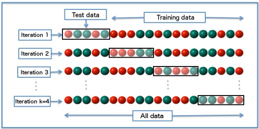
Illustration of the cross-validation. From Wikipedia.
Leave one out cross-validation (LOOCV)
The leave one out cross-validation is a specialization of the \(k\)-fold cross-validation, with \(k=n\). For each point, you train the model over the \(n-1\) other points, predict the label (or value, in the case of a regression problem) and average the errors.
Hyperparameters tuning
The reason to perform cross-validation is to enable the tuning of hyperparameters (or doing feature selection, but I will focus on hyperparameters tuning). They are parameters that are not directly infered from the data (this definition is quite lose). Per example, in the case of a linear regression, the coefficients of the model are directly infered. In the case of a penalized regression, the penalty parameter is not infered during the training procedure (if there is a way to select it, please let me know in the comments), and the usual way to chose the best penalty parameter is by cross validating many models, with different penalty parameters and chosing the one which achieves the best score (the highest accuracy, the lowest error…).
This is where cross-validation becomes costly : suppose you want to try \(10\) values of your hyper-parameter (this can be much higher), and evaluate the performance of each hyperparameter with a \(5\) fold cross-validation. This will be \(10 \cdot 5 = 50\) times longer than training a single model !
Usually, there is not one single hyper parameter. In the case of the Support Vector Machines with Radial Basis Functions, there are usually two of them which are tuned \(C\) and \(\gamma\). Trying \(10\) values for each hyperparameter now leads to \(100\) models to train (which is in turn multiplied by the number of folds).
This explains the need for smarter approaches to cross-validations.
Generic implementation
Cross-validation is a long process. And it needs to be repeated. Many times. Maybe even more when the number of parameters is large. The leave-one-out cross-validation is the longest one, as you have to train the model as many times as you have data points.
You have two options. Find the best implementation of your algorithm given your problem. Buy more computation power.
Assuming you have already achieved the first step and that the second one is not really satisfactory, there is another option. Change your cross-validation method! Though it needs some efforts (the usual cross-validation pipelines/loops have to be specialized), it will be fun!
Following the article about time complexity and enjoying the fact that, when you train a model on a specific fold during a cross-validation, you may reuse part of your calculations, I will present some tips to make this cross-validation faster.
As always, this improvement has a price : genericity. When using scikit learn, the models have similar signatures. The cross-validation procedure has to be written only once and works for every model. See per example the code below.
import pandas as pd
import numpy as np

from time import time
from sklearn import cross_validation

class Stacker:

    def __init__(self, penalty, n_folds, verbose=True, random_state=1):
        self._penalty = penalty
        self._n_folds = n_folds
        self._verbose = verbose
        self._random_state = random_state

    def Run(self, X, y, model, predict_method):
        kf = cross_validation.KFold(
            y.shape[0], n_folds=self._n_folds, shuffle=True, random_state=self._random_state)
        trscores, cvscores, times = [], [], []
        i = 0
        stack_train = np.zeros(len(y))  # stacked predictions
        for i, (train_fold, validation_fold) in enumerate(kf):
            i = i + 1
            t = time()
            model.fit(X.iloc[train_fold], y.iloc[train_fold])

            tr_pred = predict_method(model, X.iloc[train_fold])

            trscore = self._penalty(y.iloc[train_fold], tr_pred)

            validation_prediction = predict_method(
                model, X.iloc[validation_fold])
            cvscore = self._penalty(
                y.iloc[validation_fold], validation_prediction)

            trscores.append(trscore)
            cvscores.append(cvscore)
            times.append(time() - t)

            stack_train[validation_fold] = validation_prediction

        if self._verbose:
            print("TRAIN %.5f | TEST %.5f | TEST-STD %5f | TIME %.2fm (1-fold)" %
                  (np.mean(trscores), np.mean(cvscores), np.std(cvscores), np.mean(times) / 60))
            print(model.get_params(deep=True))
            print("\n")

        return np.mean(cvscores), stack_train
Not only it performs a cross-validation, but keeps the out-of-sample predictions for each fold. This allows to do model stacking, another topic I will probably discuss in antoher post.
As you see in this code, there is no information regarding the model needed. It will just take a model, that has a fit method, and predict it (the predict method must be passed as a function, it allows post processing of the predictions, per example).
Tailor made implementations
Linear regression
Here, the specialization works so well that one can even use the following closed formula for a leave one out cross-validation
Following the equation of a linear model : \(y = X\beta + \mathbf{e}.\) it is well known that (for an OLS estimate) \(\hat{\beta} = \underset{\beta}{\operatorname{argmin}} \| y-X \beta \|^2\) we have \(\hat{\beta} = (X'X)^{-1}Xy\).
So we can write :
\[\hat{Y} = X\hat{\beta} = X(X'X)^{-1}X'y = \mathbf{H}y\]
Where \(\mathbf{H} = X(X'X)^{-1}X'\)
If the diagonal values of \(\mathbf{H}\) are denoted by \(h_{1},\dots,h_{n}\), then the cross-validation statistic can be computed using:
\[\text{CV} = \frac{1}{n}\sum_{i=1}^n [e_{i}/(1-h_{i})]^2,\]
Where \(e_{i}\) is the residual obtained from fitting the model to all \(n\) observations. See [4] for more details.
Elastic-net
The famous library glmnet [3] solves the following problem, over a whole “path” (i.e. having \(\lambda\) varying) while being as fast as one would normally compute the solution for a single value of \(\lambda\).
\[\hat{\beta} = \underset{\beta}{\operatorname{argmin}} (\| y-X \beta \|^2 + \alpha \lambda \|\beta\|^2 + (1-\alpha) \lambda \|\beta\|_1)\]
The least angle regression (LARS) algorithm, on the other hand, is unique in that it solves the minimzation problem for all \(\lambda\) ∈ [0,∞] […] This is possible because the lasso solution is piecewise linear with respect to \(\lambda\).
The library comes with a cross-validation method supporting parallelization:
cv.glmnet(x, y, weights, offset, lambda, type.measure, nfolds, foldid, grouped, keep,
parallel, ...)
SVMs
The same authors proposed a similar method for calculating solutions to SVMs calibrations, where a path of solution depending on \(C\), the cost parameter is proposed.
An R package svmpath is available. Refering to the article:
It exploits the fact that the “hinge” loss-function is piecewise linear, and the penalty term is quadratic. This means that in the dual space, the lagrange multipliers will be pieceise linear (c.f. lars).
require("svmpath")

N <- 500
P <- 2
sigma <- 0.1

X <- matrix(rnorm(N * P), nrow = N)
Y <- 2 * (X[, 1] + X[, 2] * X[, 2] + sigma * rnorm(P) > 0) - 1

svm_model <-
  svmpath(
    x = X,
    y = Y,
    kernel.function = radial.kernel,
    plot = F
  )
plot(svm_model)

Xtest <- matrix(rnorm(N * P), nrow = N)
Ytest <-
  2 * (Xtest[, 1] + Xtest[, 2] * Xtest[, 2] + sigma * rnorm(P)  > 0) - 1

pred <-
  svmpath::predict.svmpath(svm_model, newx = Xtest, type = "class")

eval_error <- function(predicted) {
  return(mean(abs(Ytest - predicted)))
}

errors <- apply(X = pred, MARGIN = 2, FUN = eval_error)
plot(
  svm_model$lambda,
  errors,
  main = "Out Of Sample error rate",
  xlab = expression(lambda),
  ylab = "Error rate"
)
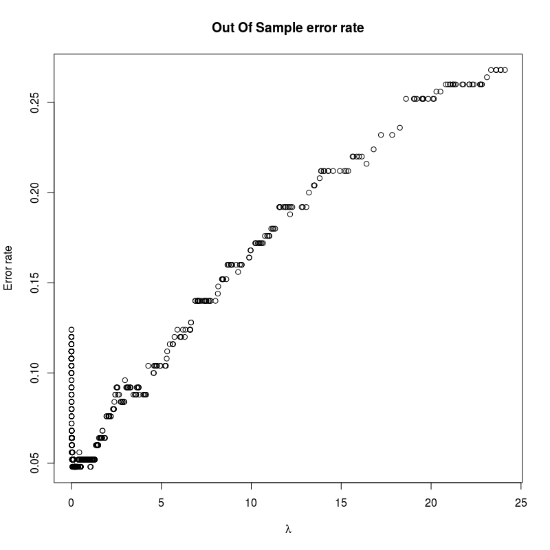 Unfortunately, it has a very large memory consumption event for small data sets.
Gradient boosting
With gradient boosting, when cross validating over the number of trees, a simple observation is to note that models are trained sequentially. If \(k\) models are trained over \(k\) folds, each model will predict a new point based on the following equation:
\[\hat{y}=\sum_{i}^{n_{trees}}\gamma_iT_i(x)\]
Now, by simply truncating the sum, one can create the sequence:
\[\big(\hat{y_T}=\sum_{i}^{T}\gamma_iT_i(x)\big)_{T<n_{trees}}\]
For each fold, this step can be performed, so that the performance at each step can be evaluated. XGBoost implements something along these lines (with callbacks), the method can be found on their repository [6].
cv(params, dtrain, num_boost_round=10, nfold=3, stratified=False, folds=None,
    metrics=(), obj=None, feval=None, maximize=False, early_stopping_rounds=None,
    fpreproc=None, as_pandas=True, verbose_eval=None, show_stdv=True,
    seed=0, callbacks=None, shuffle=True)
A generic framework
All this is nice, but it means that each method requires a specific cross-validation routine, depending on the parameter one is focusing on. It makes it quite complex, forces to write more code (and make mistakes). It would be amazing if there were something that is generic, wouldn’t it ?
There is. All the ideas summarized here come from the paper [1] of M. Izbicki. I really recommand going through it (especially if you have a taste for algebra).
The idea is to consider :
-
the data, being a monoid with a concatenation operation : \(A \clubsuit B\) is just the bindings of the rows of \(A\) with the rows of \(B\) (the neutral element being an empty set).
-
the learner \(m\) which, given some input data, returns a model \(T : A \ \rightarrow (f:x\rightarrow \text{label})\)
-
a morphism \(\diamondsuit\), so that \(m(A \clubsuit B) = m(A) \diamondsuit m(B)\)
Now, if \(\diamondsuit\) can be evaluated in a constant time (independant of the length of \(A\) and \(B\)), one can have cross-validations in \(O(n+k)\) instead of \(O(kn)\). This works for Naive Bayes, nearest centroids, and other methods.
Now the algorithm presented is the Monoid Cross Validation. Keeping \(n\) the number of points and \(k\) the number of folds for the notations, and \(G_i\) the i-th fold for the k-fold cross-validation, \(k\) models are trained on each fold. Now the models are merged in \(k-1\) operations (using the morphism relationship) and the prediction is performed over the last fold. If the prefixes and suffixes are evaluated beforehand (i.e. building the sequences of models trained on the various folds in the two orders) a method enables to obtain the cross-validation in \(O(n+k)\) operations.
This topic is really interesting and I probably will dedicate it a full article. What about a toy ocaml implementation ?
References
[1] M. Izbicki, “Algebraic classifiers: a generic approach to fast cross-validation, online training, and parallel training,” p. 9.
[2] T. Hastie, S. Rosset, R. Tibshirani, and J. Zhu, “The Entire Regularization Path for the Support Vector Machine,” p. 25.
[3] R. J. Tibshirani and J. Taylor, “The solution path of the generalized lasso,” The Annals of Statistics, vol. 39, no. 3, pp. 1335–1371, Jun. 2011.
[4] “Plane Answers to Complex Questions: The theory of linear models” Ronald Christensen
[5] XGBoost source on Github
Learning more
For those interested about ideas in statistics stemming from algebra (and not only matrix operations) and geometry, I am only aware of two books covering this topic : Algebraic and Geometric Methods in Statistics and Lectures on Algebraic Statistics